Bekijk terug alle berichten.
Amiga DFunk

For those unfamiliar with the demoscene, it's a geeky gathering, usually with some friendly competition, to show off creative and technical skills by making "demos": a short media production combining graphics, music and cuttin edge programming into 1 showcase.
Specifically in the retro computer scene, it's also a continuous quest to see how far you can push these wonderful machines and to make them do things never dreamed possible.
We opted for a 64kb "intro" for the Classic Commodore Amiga 500 - a personal computer released in 1986 with 1MB of total memory and a humble CPU running at 7mhz. (basically: a computer that is a thousand times slower then your current phone)
mA2E came up with this funky tune, I did the graphics, GigaBates coded the effects and made it all happen.
Some screenshots:
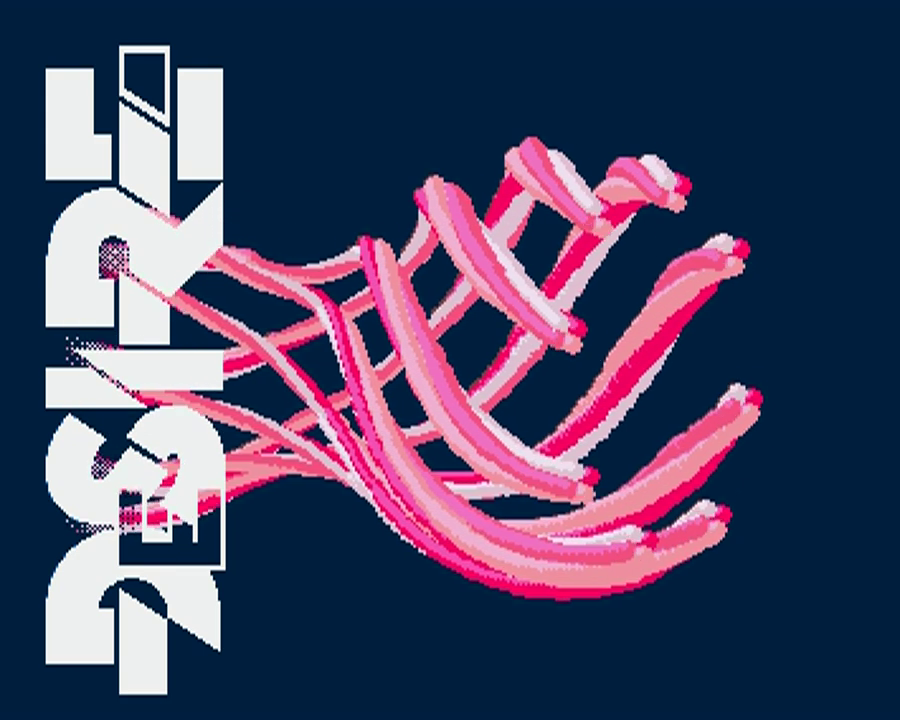 |
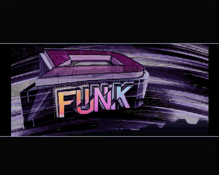 |
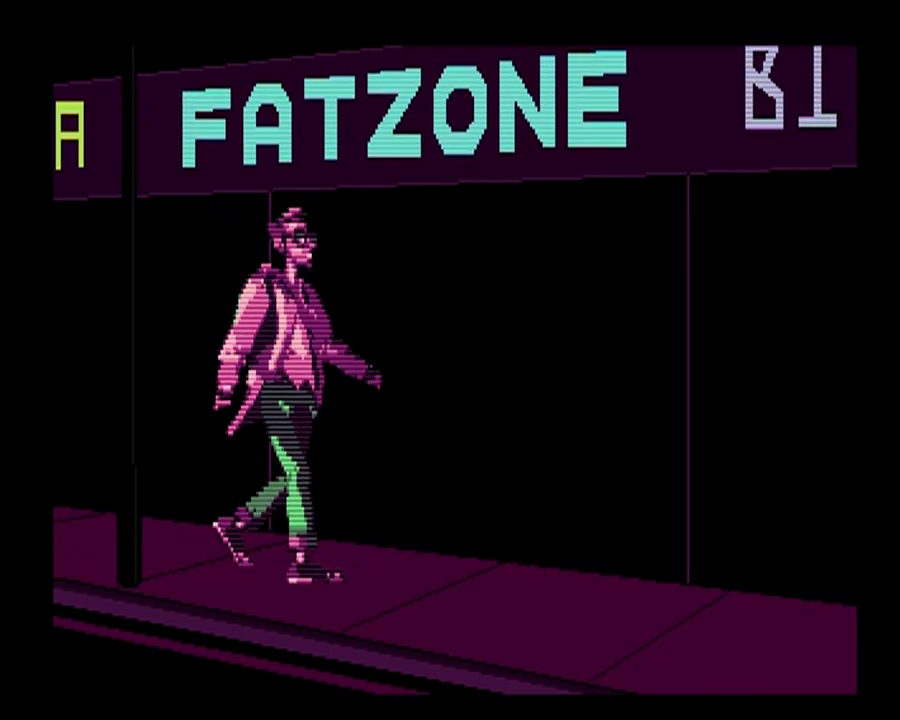 |
And here's a video capture of the demo.
- Can we reduce the colour count even more?
- Can we half the height and double it again in code while palette-shifting it, without sacrificing too much detail?
- Can we replace some parts with copper lines?
- If we loose the dithering, it compresses 1kb smaller, is that worth it?
- Can we optimize the palette even more to squeeze out those last few bytes?
- Nobody codes directly on Amiga anymore: it's all cross-compilation.
- Writing your own tools pays off: this is such a niche of a niche, that general purpose image software just isn't up for the job.
Being able the add the stuff I needed to my https://github.com/steffest/DPaint-js was super helpful to quickly iterate and get the most optimal results possible.
So: colour cycling, fine-grained palette controls and frame based animation will be part of the next release. - Hats off to GigaBates: I made rough versions of my ideas in JavaScript that need a modern browser and a multi-gigahertz CPU to run, he was able to transform that into super optimal assembler that runs on a standard 7mh Amiga 500 ... impressive!
That was fun, let's do it again!
Amiga CD32 Workbench Skin in 16 colors
So .. after 25 year there's a new update for the Classic Amiga Operating System.
yes, that's right: TWENTYFIVE YEARS after AmigaOS 3.1, there's now Amiga OS 3.1.4
That's nothing less then a small miracle.
25 years in computer land is like 12 gazillion years in normal time.
Recently there a big revival for Amiga computers with a lot of very interessing projects being done by enthusiasts - new software - new hardware ... the works!
The 'Official companies" are still plotting along - if they take a short break from suing each other, that is - but the most interesting ones are pure community projects, created out of pure love for the platform.
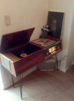
A VERY interesting one is the Terrible Fire 328 : an expansion card for the CD32 with extra ram, video out and an IDE interface, usually used to attach a bootable CF card.
Long story short: the TF328 transforms the CD32 in the coolest of all Amiga's.
But .... that new Workbench 3.1.4 still looks a little dull.

On the left is the default installation (4 colors) - Mason did create some new icons and after some copy commands it looks likt the picture on the right.
Already much better.
However ... the CD32 looks like this:

That mundane light gray and blue theme is really much too mundane for it's black and red looks.
The challenge is that this is a machine from 1993 and it's doesn't have the super fast graphic cards of today with millions of colors on 4K displays.
Allthough the Workbench can display up to 256 colors at the same time, that mode is too slow to be practical and it's more sane to only use 16 or 32 colors on a resolution of 640 on 480 pixels.
The even bigger challenge is that these colors are shared amongst all applications so each application has to adapt its colors to the ones available.
You can lock some colors (for examples for your icons) - and the other free colors can be free asigned - or battled for - by other applications.
So ...
I made a custom WorkBench theme - especially for the CD32.
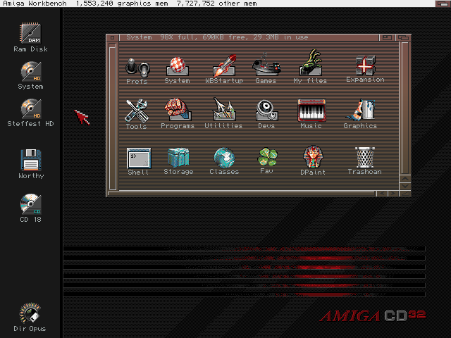
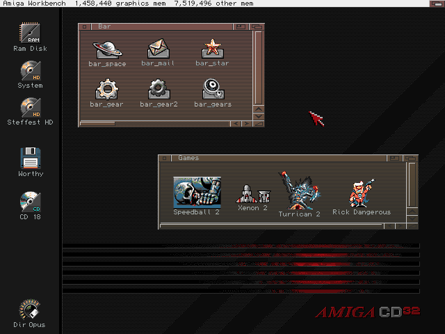
16 colors (and Copper Demon for the window gradients)
Made for square pixel screen modes (Pal hires laced e.g.)
This is the Palette:
![]()
Although it's possible to run this in a 16 color WorkBench, it's recommended to use at least a 32 color screenmode.
That way you can also set the MUI colors and still have some pens left for other programs.
Color Locker and Border Blanker recommended!
Workflow:
- First made in Photoshop,
- then color-reduced with (the super awesome) http://tool.anides.de/
- then cleaned up and re-dithered by hand back in Photoshop
- then cut out the icons and saved as NewIcons with Personal Paint on the Amiga
Everything is downloadable from here.
Some extra wallpapers and a description how to install are also there.
That was fun!
Steffest
Airwave Pong Style!
Wave you hands in the air and pong it like you just don't care!
I like old stuff: it has a story, it is used. it has flaws.
And exactly those imperfections are interesting. Waba-Sabi you know?
That's why I ditched all my CD's and moved back to Vinyl,
and that's also why In my opinion most "pre-computer music" sounds better.
When you take a basic step sequencer or midi program, it's a robot: all notes are aligned on a fixed grid and it usually takes some effort to get a "human feel" to your music.
Now what if you could ease it up a bit in a fun way?
Let's take the graphical representation of a "beat" in most common step sequencers.
and let's take this thought one step further: the graphical representation defines the music, right?
So what if we alter the graphics, would the music change too?
For example, if we want to add a fade, we can just as well use photoshop to add some blur, right?
And if we want to loosen up that fixed grid, why not use a graphical filter to make it more "wobbly"
This way we can use graphical tools to mold your music into a more organic shape.
And more!
What if we could "read" any image in a musical way?
An image consists of lot's of coloured dots, each dot has some info we can use. on a computer screen, this is for example the amount of red, green and blue and the transparency.
We can sample that info from an image and use it for something musical.
An example: move you mouse over this image of a jungle, to explore it in an audio-way. (Well ... after you click on it to open the demo, right?)

To pour that into something musical, we can use "the bouncing ball" effect: a ball bouncing around in a rectangular box has 2 rhythms that are both fixed but as the sides of the box are not equal, the rhythms are constantly shifting.
It has the predicable structure of a beat box, but also the unpredictability of 2 patterns intermingling: Exactly the interesting effect we are looking for.
Try it out for yourselves!

(Seriously: leave it running on chrome or safari for a few hours: it's very relaxing!)
Of course we don't have to use a static image, we can use a video or ... a camera!
That is when things really get interesting: when you connect a camera as your graphical/musical input source, you can interact with your musical model live, in front of your camera.
Add a little motion-tracking and color-tracking, and you get a pretty accurate way of triggering musical events using your webcam.
To go all the way back to music software, we can even add some MIDI to trigger midi events using your webcam, and to record everything you do in your midi sequencer to take it further along towards a full musical production.
Wham! Before you know it, you got yourself a playful musical instrument.
Of course, it's a bit hard to control. It's probably wise to limit yourself with some quantization or some predefined chord schematics to get the sound you want.
Fiddling around with all my prototype toys, I created this demo song - I call it "Airwave pong" (You now: Wave you hands in the air in front of your webcam - combined with pong)
To be honest, I had to do a lot of post-processing on the midi data ... my motion tracking routines are somewhat crude and fly all over the place.
If you want to try it out for yourself, come find me a Barcamp Antwerp 7 this saturday, where I will be doing a live demo and will release all the tools I used.
Yes indeed: barcamp STILL is one of the most inspiring events EVER.
The concept is simple: short and open talks about anything you're passionate about.
The presentations won't be perfect, but they will be real and honest, which makes them far more valuable then about 90% of al other talks on "professional" events.
So if you happen to be in the vicinity of Antwerp, do yourself a favour and drop by #BCA7
I can't wait !
Foto door Simon Schoeters
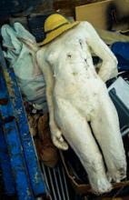
Tags: Graphics, in English, Music, Programming, Tinkering, VideoGeef je reactie (1)Over tekenen en sex met opblaaspoppen
Het is altijd een tweestrijd: een pragmatische geek zijn.
De geek is altijd verzot op gadgets en features en nieuwe mogelijkheden, het liefst digitaal en is best rationalistisch.
De pragmatische mensch is een beetje de antirationalist: altijd op zoek naar het buikgevoel, naar het "echte", naar de Platoonse essentie en heeft een hekel aan overbodige franje en ceremonie.
Bij grafische bezigheden komt dat altijd nogal hard naar voren: de digitale mogelijkheden zijn oneindig en de geek in mij is er helemaal verzot op.
Anderzijds kan niets het werken met echte materialen evenaren: het gevoel van een penseelstreek op een doek, of een potloodlijn op grof papier.
Sensueel ... ik verzeker u.
Op tablets zoals de iPad is het leuk tekenen, maar ...
Met een pen of je vinger over een glasplaat vegen ... ook dat kan ik verzekeren, daar is in de verste verte niets sensueels aan.
Vergelijk het een beetje met seks met een opblaaspop: het voldoet misschien, maar het komt niet in de buurt van "the real thing".
(vermoed ik toch ? the real thing schijnt nogal tof te zijn)
Plastic is geen vervanging voor buikgevoel.
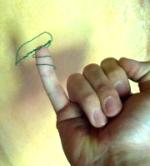
Alle beetjes helpen echter en zo ontdekte ik plots de JAJA tekenpen van Hex3. 
De prijs is vrij hoog maar ligt nog wel onder de impulsaankoopgrens. KOOP! (kijk, zo pragmatish ben ik dan ook weer ...)
Het is op zich gewoon een tekenpen voor touchscreens, maar door een vrij vernuftig systeem van bijna-ultrasoon-geluidjes die de pen uitstuurt en de tablet continu opneemt "weet" de software hoe hard je drukt op het scherm en kan daar dan iets mee doen.
Dat is een wezenlijk verschil: potlood- pen- en verfvegen reageren zo echt op de druk die je zet, wat de ervaring veel realistischer maakt.
Hieronder een kleine schets met de pen, gemaakt tijden een rit van 90 minuten tussen Hasselt en Ekeren
Jaja, dankzij de NMBS heb ik allemaal tijd voor dergelijk genot: dank u NMBS!
De titel is "And the developer performed a cool Triple Push Commit"
_2.png "Untitled artwork 2013-01-21 (07.45.57-518 PM)")
't is gemaakt in ProCreate: een echte aanrader voor tekenaars en veel beter dan mijn vorige favoriet Sketchbook Pro
De pen werkt trouwens ook prima op Android, maar echt goede tekenpakketten heb ik daar nog niet gevonden.
Ik moet zeggen: het zorgt zonder meer voor dat lekkere smeuige handgemaakt effect, wat best moeilijk te bereiken is met digitale technologie.
Overigens is dat evenzeer de verdienste van ProCreate dan van de JaJa pen, maar het is een prima combinatie.
Hier een detail: 
ProCreate heeft echt een goede teken-engine: de blending tussen lagen en kleuren is prima en het is 1 van de weinige tekenapps die een goede "smudge" functie heeft.
Maar toch ... het blijft een stukje plastic dat over een glazen plaat schuift.
Daar zit toch nog een hoop ruimte voor verbetering, hoor, in die tablet technologie: een oppervlak dat op zich drukgevoelig is en mooi reageert met haptische feedback en aangepaste oppervlakte weerstand. Alles afzonderlijk bestaat dat al in prototype, maar het zal nog even wachten zijn voor dat in 1 device tot de consument is geraakt.
Ondertussen zal ik me wat behelpen met de Jaja en proCreate.
Het mag dan wel nep-sex zijn, het is toch wel fijn.
Spitting Image

een portretje van mijn Ma en mijn Pa
Spitting Image!
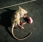
Mummy Rat
En dan vindt er iemand een gemummificeerde rat in de schuur.
Cool Stuff!


Ipad Sketchbook


This is a preview of a little project i'm working on.
2 weeks ago i composed and recorded a new song using only the iPad and its internal microphone.
The goal was to see if and how a "consumer" device like the ipad could be used to "create" content.
Of course it can, and it turned out to be great fun too!
At the time i thought creating the videoclip also entirely on the ipad would be a bit of a stretch but after some fiddling around I got completely hooked on Sketchbook Pro.
As i quite like drawing, I think I tried all the drawing and sketching apps I could find in the AppStore.
In the end there are only a few good ones, and only one that clearly is on top: Autodesks Sketchbook Pro.
Back in the day my favourite sketching material was soft pastels on paper - creating very 16-year-old-stuff when i was 16 years old
like this ![]()
Sketchbook on the iPad gives me (almost) the same direct finger feeling of pushing and swiping and brushing and smudging with nothing in between you and your sketch. No pencil, no brush, no pen, ... just some color and your fingers.
I tried every tablet since the first tabletpc's in early 2000 but this combination of great finger specific software like sketchbook and great finger specific hardware like the iPad is the first one that really delivers as intuitive and transparent drawing tool.
As I think of it, sketchbook was also the first drawing application I ever tried on any iOS device: on @Topanga's iPhone at a twoooze with a very quick sketch of @mathiassbaert.
It was also the first time I thought "hmmm . . . . Maybe those Apple devices have some strong points after all" :-)
Anyway, Now I find myself handdrawing a (small) videoclip - stitching every frame together with ReelDirector
I'm about halfway through with about 80 sketches to go (at an astonishing 1 frame a second).
Thank god for the NMBS and their never-ending train delays which give me plenty of time to doodle along.
I hope to be finished in a week or two.
The biggest problem: blisters on my fingertips!
Under-the-Tree Sketches part 2
2 more Under-the-Tree sketches.
not good ones. 

the last one is already way past it's "you-really-should-stop-now" point.
I always know when I cross that line but very rarely actually stop there :-)
Lo-tech Sketching
2 weeks without internet and gadgets: what a treat! :-)
Sitting under a tree, one of the most relaxing things - for me at least - is drawing. There's something very Zen like in the way the pencil point scratches the surface, leaving a gentle trail that slowly reveals what's been hiding in the paper.
Unintentionally, there's seemed to sneak in some sort of theme in the sketches I made.
Here are 2 of my drawings.
No title as of this moment, we'll see if they ever link together into something meaningful. 

All made with my favorite pencil: a black automatic pentel P205A pencil with 5mm HB fillings in my little square sketching journal.
Jarenlange mishandeling

Zoals bij 95% van Vlaanderen werd er ook hier stevig in de tuin gewerkt.
De lente hing immers in de lucht en dan komt een mens buiten.
Met snoeischaar getogen werden de Catalpa's weer stevig gekortwiekt.
De sporen van deze jaarlijkse mishandeling staan inmiddels diep getekend in hun knoesten, maar het is hun eigen dikke schuld: Ze moeten zo hard ook maar niet groeien.
Sommige takken meer dan 3 meter op een jaar, wat in de lenteperiode soms op 3 tot 4 centimers per dag uitkomt.
Verbazend, ge zou maar eens in slaap durven vallen tegen zo'n boom. Voor dat je het weet bent je ingegroeid.
Ik vraag me trouwens af hoe ik eruit zou zien als ik elk jaar zo toegetakeld zou worden ...
De volledige reeks foto's vind je op http://www.stef.be/foto/knoest
Victory at AuctionArt

The Battle was Fierce,
But with Cunning Patience and Stamina - I was able to achieve Victory in the first ever web 2.0. AuctionArt .
AuctionArt is an initiative of Belgian artist Jan Leenders, who is also running the Twit2Art project. (see previously)
But what a Devious Counterstrike: Auction Art #2 seems to be a sequel (and in my case, a very true one)
Only one solution: Gentlemen, place your bids !
Harige dingen
Ik moet eens stoppen met zulke lange blogposts te schrijven. Pfft
Vandaar even een schaamteloos gepikt dingetje.
De volgende keer dat iemand zich afvraagt welk lettertype deze keer eens te gebruiken, waarom deze niet?
Gemaakt door Craig Ward.
Ik wou dat ik zoiets kon ... (hier meer typografie wonderen)