Curiously enough, the economist has a good App... the good thing about it is you get exactly the same look and feel as you get from the paper edition and has no added media...
What they got right is they propose the economist as is on the iPad and don't assume or market anything else. In this case, simple is great.
I really try to keep a positive mindset,
but sometimes I have to whine a bit :-)
Looking back at 2010, the biggest disappointment of the year is .... digital magazines.
The future looked so bright:
sexy consumer devices like the iPad would save the publishing industry and everyone would be happy.
Publishing software companies like Adobe rushed out digital publishing solutions like the Digital Publishing suite.
Every publisher and newspaper went head over heals to release some form of iPad app, pushing their digital content to thousands of eager new readers.
One slight problem: THEY ALL SUCK !
Really, everybody who's happy about the current state of iPad magazines must have had really low expectations.
Almost all publishers took the fast and easy approach and just whipped up some sort of image viewer offering their existing print-ready documents to the screen.
Very understandable: it's the safest thing to do with the lowest amount of risky new investments.
As in most cases, the fast and easy approach rarely is the best one.
It results in substandard products that are a mere shadow of what they could have been.
Simply copying the paper based layout to a screen does NOT result in pleasant reading experience: as most readers screens are too small to display one standard printed page in a readable manner, you end up zooming and scrolling in all directions, hunting for the flow of an article.
So called "premium content" mostly consist of making links clickable and whacking YouTube video on top of static pages.
And it's such a shame: there's so much great content out there and thousands of people willing to pay for it.
I would gladly pay for a decent magazine, after all creating content is a tough job, there's a reason why there are professional journalists.
Is it too mush to ask for an enjoyable reading experience?
Stop converting paper pages to the screen: it didn't work for the web and it certainly doesn't work for e-readers.
Digital publishing still is a niche, but the only way to expand it is to create a compelling product specifically targeted for e-readers.
To all publishers: take a look a the various eBook readers as they already solved most of you problems
- offer customizable fonts
- offer adjustable font sizes and FLOW your text: there's nothing as annoying zooming in and having to scroll from left to right constantly because the text doesn't wrap.
- provide both landscape and portrait layouts. yes, that's more work for your understaffed design team but it's a need-to-have , not a nice-to-have
- DON'T publish you magazine as a series of static image files, unless you're a comic. Keep text as text, images as images.
This is an example of a zoomed in page of 'The Tijd" newspaper app (which is a series of jpeg images)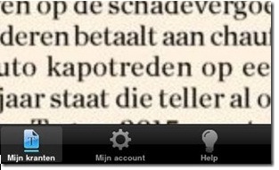
It's hurting my eyes! - integrate multimedia directly from the start into the articles, don't add them later as some form of icing on the cake: don't decorate, design.
- don't launch your readers outside your magazine with your external links, handle them internally.
- avoid scrolling, paginate
- if it's too expensive to design a digital version of your magazine, leave out the design and just offer the articles as text.
Whatever you do, DON'T simply reuse your paper design.
Reading an eBook on e.g. iBooks, Stanza or a Kindle is relaxing and comfortable because they follow those rules.
Reading a magazine or a newspaper on the iPad is frustrating and annoying.
One shining good example is the Wired tablet app: very well made, good use of media, optimized layout.
The only thing missing is scalable fonts.
The worst examples are all those Magworld magazines. For example the music magazine OOR. That's one example that is SCREAMING for a digital multimedia version, but in its current offering it's completely crap on a digital device. What a missed opportunity ....
Am I alone in this frustration? Some seem to think so, but again: don't settle for "good enough"
"good enough" won't stick, and ultimately: "good enough" won't keep selling.
Maybe I missed some magazines that DO get it right?
I hope so, please let me know.